Brand colors for your company! choosing the perfect color is as important as creating a logo, selecting the brand name and font type, etc..; all of these factors combined, make up the face of your brand.
They say first impressions are important. This is especially true when it comes to your brand. Your brand color is probably the first thing the customers see. Colors evoke emotions, and they convey implicit information. This allows customers to make a first impression without knowing what your product is all about. Simply put, brand colors have a powerful role in helping customers decide whether or not they will care about your brand. Because we know how difficult it can be to settle on a consistent color scheme for your brand, we put together this guide to help you.

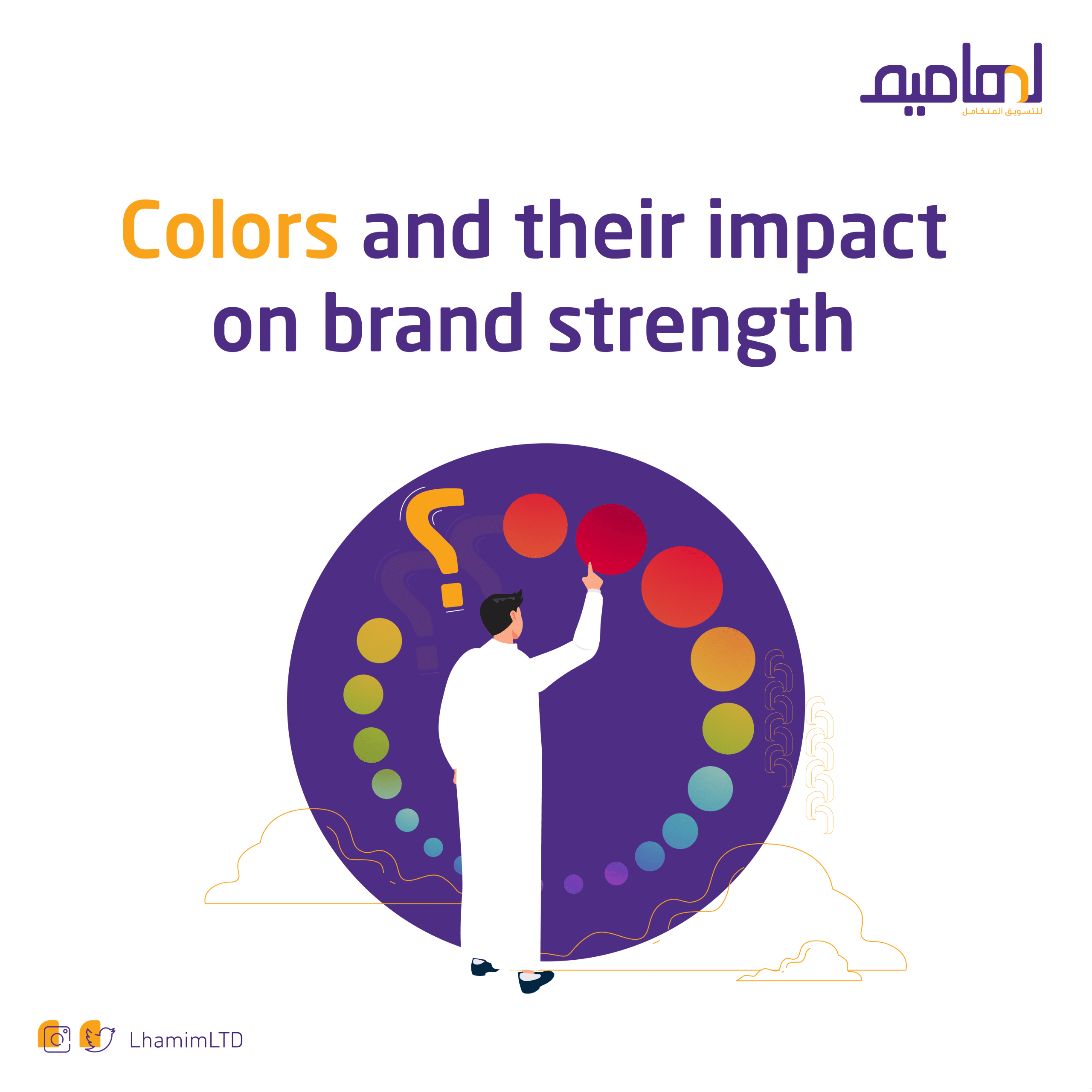
Why is choosing the right brand colors important?
When it comes to brand colors, think about the brands you see regularly! Think about “McDonald’s.” What color is its trademark? “Yellow,” isn’t it? And what is the brand color of LinkedIn? Can’t it be called blue, what about Netflix? Red and black. This was a memory exercise to show you how brand colors can make an impression in your mind; this is because we associate brands with colors to help us remember them.
Choosing the right brand colors for your company is essential to becoming a memorable brand. These colors in your logo and other visual marketing materials are the face of your brand in front of customers and users. You can even think of brand colors as a company uniform.
Colors are more likely to evoke an emotional response than anything else; one of the most famous color theorists, Faber Birren, wrote about the connection between colors and our emotional state, especially in his book “Color Psychology and Color Therapy.” For example, Colors like red and blue create different human responses, and what’s more interesting is that the same colors tend to elicit similar reactions in different people. (Find out more about emotional marketing: How to track consumer sentiment and increase your sales).

We all know that red is associated with danger and green is associated with nature, but both have additional meanings and associations. Color psychology allows us to understand and use color to our advantage, especially when it comes to marketing and branding.
Color psychology: It is the science of studying how colors affect perceptions and behaviors. According to studies, 62-90% of product reviews are based on colors alone, so it’s important to get your brand’s color palette right.
6 steps to help you choose the right brand color
Try not to start the process of discovering your brand colors on your own. Have brainstorming sessions with your team. If you don’t have a team yet, work through the following steps and show friends and colleagues your process and get their opinions.
Step 1: Define your brand identity and core values.
Before you can do any kind of visual branding strategy work, such as choosing fonts, colors, or logos, you need to do some preliminary work. Ask yourself these questions:
-What is your brand story?
-Why did you start this company?
-What do you solve for your customers?
-Who are our ideal customers?
-How would you like them to feel when interacting with your brand?
– In what cases and places is your brand located?
The answers to these questions will provide the basis for learning how to use color to spread your marketing message. Colors are associated with emotions, memories, and gatherings. Knowing these things helps in choosing the right brand colors.
Step 2: Consider color psychology and colors’ meanings.
After all the knowledge you recorded in the first step, it’s time to start researching the possible colors for your brand. Part of the process of choosing the right brand color is analyzing their cultural and associative meanings.
There are a few things to consider in terms of the association of color, culture, and perception:
-Is your brand local, national or international?
-Are there colors in your culture that really mean something?
-Do you sell gender-specific products or services, or are they gender-neutral?
-Does your brand need influence, comfort, urgency, inspiration, or something else?
-Where does your brand fit: technology, environment, education, etc.?
It is important to remember that colors have good and bad connotations; most of the time this can be changed by tonality, while other times it is controlled by accompanying visual assets such as logos and other colors in the brand palette.
Step 3: Select the primary color and the secondary color.
Every brand, regardless of color palette, needs a bold color and a light color to balance it out. These colors can be pure black and white but can also be gradations such as taupe and yellowish-white. It depends on the visualization you want to achieve.
Your brand may only need one primary color in addition to the balancing colors. For example, Netflix uses red, black, and white only.
Step 4: Use the palette generator to create different shapes.
Once you have the primary and secondary colors, it’s time to create some palettes. Remember that you will always need black and white or a close version of them, to match your brand colors. Keep this in mind when creating the palettes.
Step 5: Choose a primary color palette.
Save your favorite color palettes to guide designers who will later work on your brand identity.
Step 6: Choose a secondary color palette.
The choice of secondary brand color palette is entirely up to you. You may need it, or you may not. However, it is better to create it from scratch and use one of the colors in the base palette for starters.
How did the most famous companies choose their brand color?
Think about the brands you interact with every day and how color plays a role in their visual identity. Coca-Cola is red, Cadbury is purple, and Apple is white; why do brands like Google Play use multiple colors?

Coca-Cola‘s brand colors
The distinctive red color of Coca-Cola appeared for practical reasons. According to the brand: “Since the mid-1990s, alcohol was taxed but soft drinks were not, so at that time we started painting our barrels red so tax agents could distinguish them from alcohol during transport. But it was a good move for other reasons including that we now know that red can be a catalyst for impulsive buying.”

Cadbury‘s brand colors
Rumor has it that Cadbury’s royal purple, aka Pantone 2865c, was chosen as a tribute to Queen Victoria, over 100 years ago. Cadbury first attempted to trademark the color in 2004. However, the chocolate war began with Nestlé, which argued it wasn’t distinctive enough to be owned. In 2008, Cadbury secured its trademark to prove that unique colors are worth fighting for.

Apple‘s brand colors
Steve Jobs chose white for two reasons. The first reason was his knowledge that white was the color of purity, so it was in line with his vision of beautifully designed products. The second reason was because of competition; at the time, the dominant shade used by computer manufacturers was gray.
Conclusion:
Distinct numbers are the ones that are easy to remember; charismatic people are the people we remember the most, and the same applies to brands. A distinctive identity and a strong presence are what is remembered compared to competitors. The way of mixing simple textual and visual elements is what conveys this distinction to the audience and instills it in their minds.
At Lhamim, we help you build an identity that distinguishes you from your competitors and makes you present in the minds of your customers, through a team that has been working for years in creating different identities and achieving them to impress everyone who encounters them and makes him attracted to deal with them. Contact us now.